Ethical Anti-Design: The Road to No-Nonsense Productivity
Nobody wants to be an asshole, right? That’s why in this article we’re digging into the principles of, wait for it, anti-asshole design (AAD). We also try to de...
Nobody wants to be an asshole, right? That’s why in this article we’re digging into the principles of, wait for it, anti-asshole design (AAD). We also try to define “ethical design” and see how it can help teams and individuals get work done faster and smarter, with no fluff.
🤔 What Is Design Ethics & Ethical Design?
“Design is in everything we make, but it’s also between those things. It’s a mix of craft, science, storytelling, propaganda, and philosophy.”
Erik Adigard, Communication and Experience Designer
Ethics—a set of moral principles that defines the “right” and “wrong” end of your actions—is the compass that helps take the right turns in work and personal life.
But did you know that the final design of every product, be it a lollipop wrapper or a piece of software, is also a reflection of its designer’s moral code?
Enter design ethics.
“Design ethics concerns moral behavior and responsible choices in the practice of design. It guides how designers work with clients, colleagues, and the end users of products, how they conduct the design process, how they determine the features of products, and how they assess the ethical significance or moral worth of the products that result from the activity of designing.”
In a nutshell, design ethics are all the visible and invisible design choices that influence how we perceive and interact with products. They’re the strings behind the curtain.
Take for example the bio-degradable bamboo toothbrushes, an eco-friendly twist on the design that dates back to the 1400s. Replacing polypropylene handles with a sustainable material is a fine example of good design ethics.
So, what about intangible products like software? Is it subject to the same, or at least similar, principles of design ethics? If so, what qualities should it have?
Well, according to the Ethical Design Manifesto—modeled after Maslow’s hierarchy of needs—by Small Technology Foundation, ethical design works on three distinct levels.
- 🚀 It aims to make products intuitive and fun to use.
- 🍰 It acknowledges human flaws but doesn’t take advantage of them.
- 🔐 It respects basic human rights, like the right to privacy.
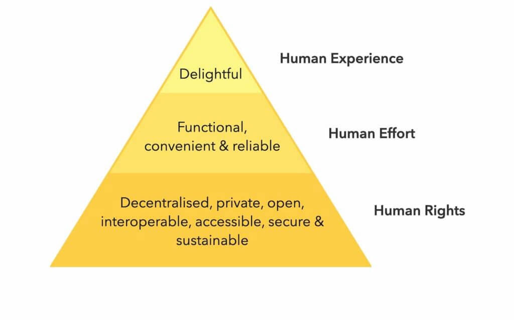
Ethical Design Manifesto by Laura Kalbag and Aral Balkan(2)
The only problem?
Designing software, or any kind of product for that matter, is a complex, multi-leveled process. And that means many things can go terribly wrong.
🌱 The Rise of Anti-Asshole Design (AAD)
"It seems that perfection is reached not when there is nothing left to add, but when there is nothing left to take away"
Antoine de Saint-Exupery
When designers miss or choose to ignore the principles of ethical design, it’s the users who suffer the consequences. And there’s a fair share of those.
Think of all the unskippable ads, elusive unsubscribe links, and invasive privacy settings. These are asshole moves, and they rank pretty close to ditching the headphone jack or... the final season of Game of Thrones.
While not every “user-hostile” design decision is ill will, some of them are. The mechanisms and practices that are intentionally misleading or confusing users are called dark patterns.
“When you use websites and apps, you don’t read every word on every page - you skim read and make assumptions. If a company wants to trick you into doing something, they can take advantage of this by making a page look like it is saying one thing when it is in fact saying another.”
Dark Patterns(3)
For instance, the “hidden costs” technique is meant to lure online shoppers with attractive offers only to top their bill with out-of-the-blue charges at checkout.
In response to that unfavorable trend, the Reddit community came up with r/antiassholedesign, a subreddit dedicated to products that simply make sense.
“An offshoot of /r/AssholeDesign: Antiasshole design is design that benefits the user at the expense of the company. Any feature, however easy to implement, that helps the user and makes the company no money (and cannot be advertised) is AAD as well.”(4)
Think of the anti-asshole design movement as a more blunt take on ethical design. It gives credit to mindful designs that go the extra mile to make users feel good.
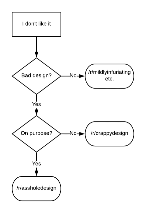
Asshole design flowchart by u/altogether_elsewhere(5)
When it comes to software, AAD products should:
- 🧘♂ Reduce distractions and help users stay focused on tasks.
- 🚀 Provide essential features and cut out bloated functionality.
- 🍰 Be inclusive and accessible to people with varying technical skills.
- 🤔 Offer progressive disclosure so users can learn at their own pace.
- 👋 Make it ridiculously easy to unsubscribe/delete an account.
- 🌱 Offer transparent and customer-friendly refund policies.
- 🌤 Leave plenty of room to grow for more advanced users.
But there’s more.
In software development, anti-asshole design combines the principles of minimalism—very simple UI, minimal learning curve, instant usability—and holistic, no-nonsense usability. It helps you accomplish your goals with the least amount of friction.
And that poses an important question…
Why Does Anti-Asshole Design Matter in 2021?
“Engineers and designers simultaneously know too much and too little. They know too much about the technology and too little about how other people live their lives and do their activities”.
Donald Norman, Co-founder of the Nielsen-Norman Group
How does your typical work-at-home day look like?
You wake up happy and energized, brew some coffee, roll up your sleeves, and sit down to work. But before you do that, you open up Facebook or glance at Google News, you know, just so you don’t miss anything important.
The next thing you notice, you’re in deep, sucked by the infinite scroll, pumping dopamine and looking for the next shot of excitement.
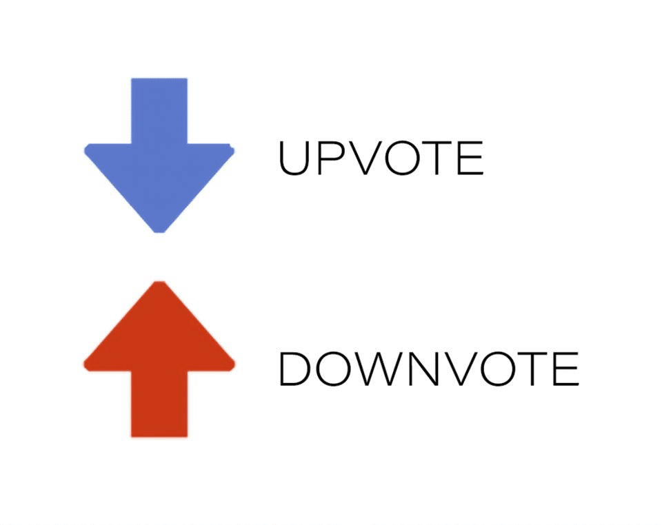
When you finally decide to do something productive, you open up your inbox. You’re instantly bombarded with work emails, spam, and newsletters you don’t really care about. But you still go through all of them, because “it might be important.”
It’s already 10 am and you haven’t even started.
In a now-famous presentation ”A Call to Minimize Distraction & Respect Users’ Attention,” former Google employee Tristan Harris argued that technology has the propensity to take advantage of human weaknesses.
- ⏰ Poor time management/awareness.
- 🤯 Craving for the next big thing.
- 💭 The fear of missing out.
- 🤷♂️ Reluctance to face friction.
The result?
Let’s say there are ten people in your team, all working remotely and all equally susceptible to those vulnerabilities. Now consider the cognitive, emotional, and financial cost behind every distraction and disruptive technology you use.
“Our past technologies, such as hammers, didn’t manipulate or influence our weaknesses… they didn’t have a business model dependent on building a voodoo doll of the hammer owner that allowed them to predict the hammer owner’s behaviour, showing them videos of home construction such that mean they use the hammer every day. A hammer is just sitting there patiently waiting to be used.”
Tristan Harris & Vikas S. Shah at Thought Economics(6)
As our workflows are becoming more decentralized, we’re opening ourselves to distractions even more. Every new tool means more trouble.
When you finally open up your collaboration/note-taking/communication/scheduling toolbox, you descend into the limbo productivity porn. Organizing, planning, and customizing feels way more satisfying than doing the actual work.
🛠 What Can We Do About It?
“No design works unless it embodies ideas that are held common by the people for whom the object is intended.”
Adrian Forty
Working with unethical, badly designed software is often a matter of choice. That’s why the first step to overcoming friction and distractions is to become more mindful.
“What we want to do is block those moments that hijack your mind in ways you regret, and replace them with a different timeline—what you would have wanted to have happened instead. The resource we’re conserving is time.”
Nicholas Thompson & Tristan Harris at Wired(7)
- 💡 Make sure every new app or service your team uses is essential.
- 🧩 Don’t add complexity to the workflow and subtract whenever possible.
- ⚙️ Opt for ease of use and a gentle learning curve to maximize tool adoption.
- 🧘♂ Discourage multitasking and give your team some deep-work time.
- ⚔️ Challenge the status quo and overhaul broken workflows.
But that’s just part of the process.
The whole purpose of ethical and anti-asshole design is to nip distractions in the bud. After all, why make the user journey difficult before they even put on their hiking boots.
Collaboration software, or any kind of software for that matter, should help users overcome their weaknesses. That’s why anti-asshole design must be brought up early in the development processed and iterated across all releases.
🐑 How Taskade Embraces Anti-Asshole Design
As a fully distributed company, we understand that working with others, especially over time zones, can be tough. And we don’t want to make it an inch more difficult.
1. Guest Account and 7-Day Trial
Tired of creating a new account for every single service or app you want to try out? We are too, that’s why you don’t have to take a leap of faith with Taskade.
Taskade comes with a demo preview that lets you get your bearings and see if the app is up your team’s alley. If you do stay for longer, we have a 7-day free trial to boot.
And the best part? Taskade comes with a free plan that lets you create projects, craft templates, and collaborate with your team, with no strings attached.
2. No-Nonsense Formatting Options
Spending too much time picking the right color or font is pure productivity porn. When the entire team falls for the same trap, it’s hard to make any progress.
If you feel overwhelmed with the formatting options in collaboration/office suites, Taskade minimalist project customization will give you some peace of mind.
We don’t want you to waste precious time tinkering with pop-ups, sliders, or drop-down menus. You get just the options you and your team need to get work done.
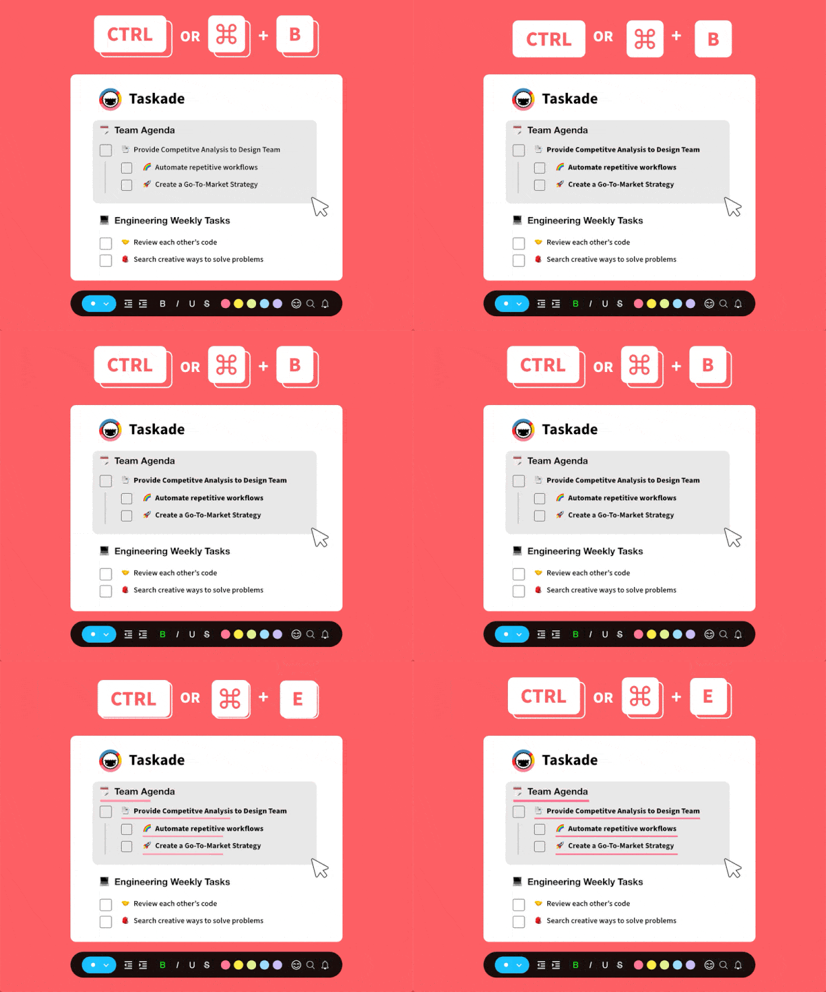
3. No Context Switching
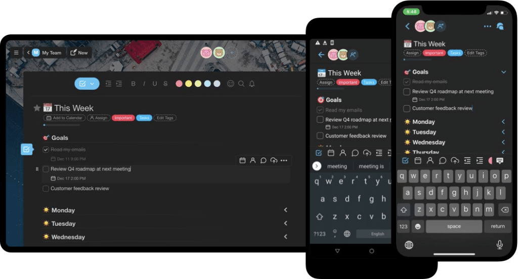
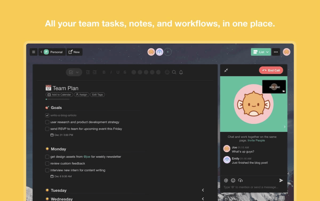
We believe forcing users to hack together different tools is an asshole move. That’s why we created a remote-native tool, built by and designed for remote teams.
Taskade gives your team a complete remote stack. That means you don’t have to shuffle apps, juggle multiple windows, and break focus doing all that.
In Taskade, work and communication happen on one plane. Every project is a self-contained real-time workspace so you don’t need any extras.
4. No Distractions
Sometimes you just want to get things done alone. You know, fully concentrate on a task without glancing at all those funny cat pictures and chat messages. Now you can.
While team communication is a core component in Taskade’s ecosystem, you can easily hide the chat window and edit projects without interruptions. But there’s more.
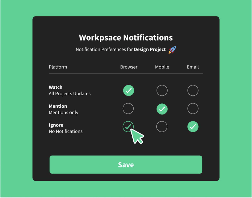
Pings, beeps, and buzzes keeping you up at night? Customize the notification settings and keep all updates at bay, at least until you’ve had your afternoon power nap.
5. Transforming Projects
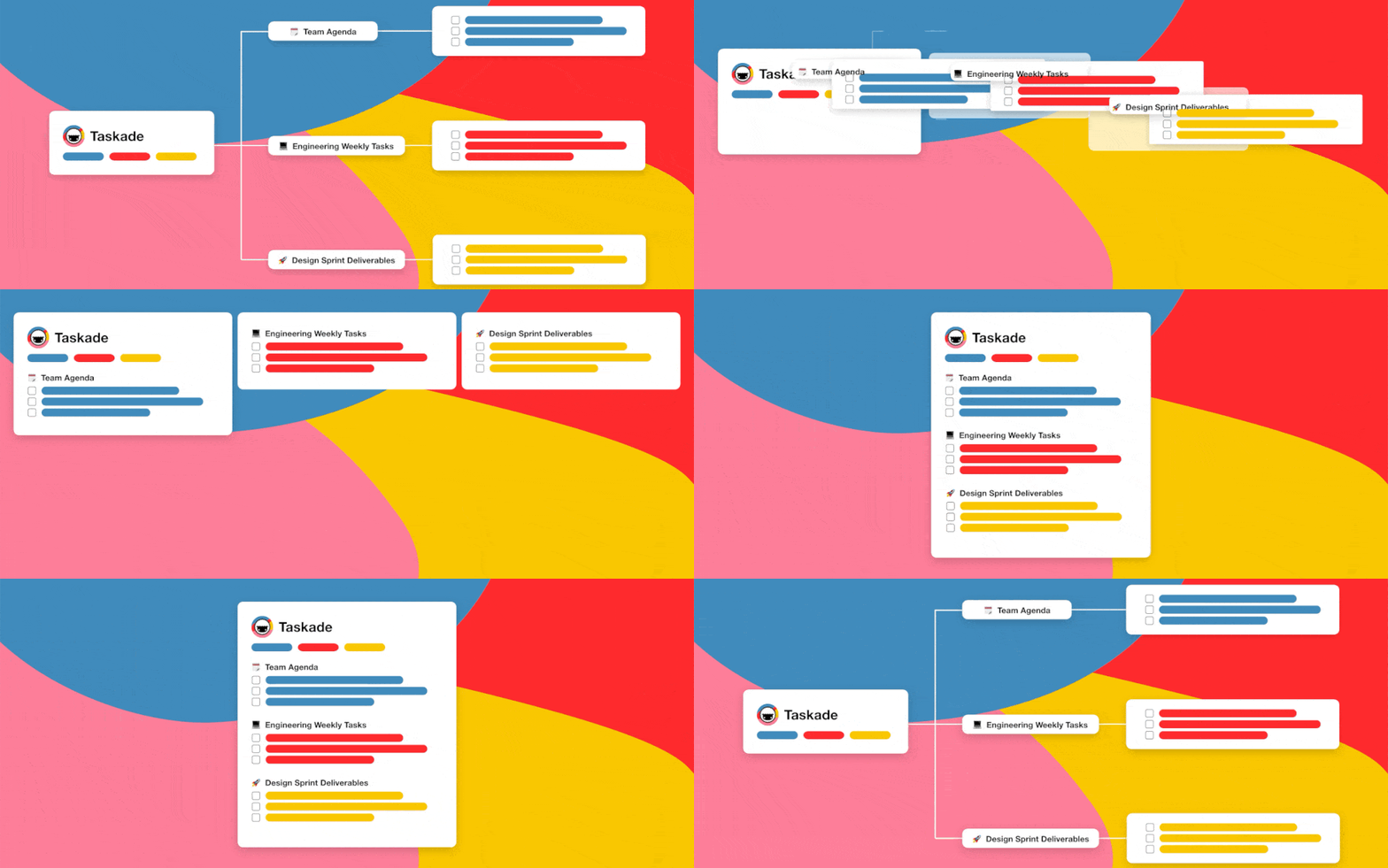
Most collaboration apps give you one pre-defined workflow. You have to live with it or… look for alternatives. With Taskade, you can work the way you want.
Taskade lets your team instantly transform projects using four unique project views—Org chart, Mindmap, Board, List, and Action—so you feel right at home.
We want our users to create unique workflows that are functional but not overwhelming. You can also create new templates or customize the ones in our gallery.
6. Local Time/Multiplayer Indicators
Coordinating work over multiple time zones takes some getting used to. You need to be more mindful of other team member’s daily routines and business hours.
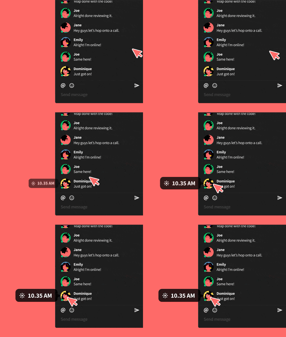
Now, with our local time indicator, you can simply hover over their profile icons to see their local time. Because nobody likes to be bothered after hours.
The multiplayer indicator, on the other hand, shows you who’s currently editing the project and the edits they’re making. Just so you don’t butt in in a bad moment.
7. Gentle Learning Curve
“Where do I click?”, “what does this button do?”,”I don’t want to break anything.” Leaving users confused and without proper guidance is asshole design.
Why waste time figuring things out? Taskade’s UI will save yours. The interface is clean and simple so you always know what the next step is.
In case you’re wondering, our onboarding setup is just one page. :)
8. Think Out of the Box
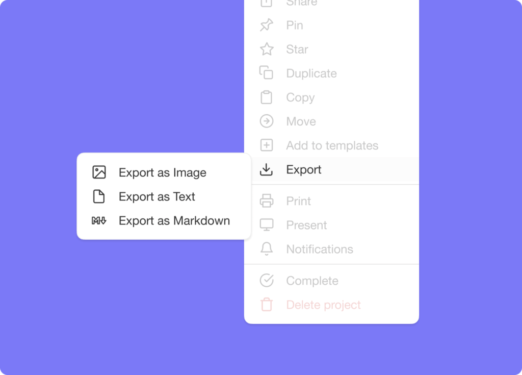
Finally, the curse of the walled garden. What good is collaboration software if you can’t actually get your stuff out when you need to?
Taskade lets you export projects as an image, plaintext, and markdown. Attach them to emails, presentations, or for print. Export as image supports all project views.
Parting Thoughts
The world is becoming more connected, and that’s a good thing. But as we’re shifting toward the distributed work culture, we also need tools that can shorten that distance.
The downside? Not every new tool, app, subscription, or newsletter does what it’s supposed to. Some are simply accidents at work, with little utility or tangible benefits. Others use insidious design practices to cheat users of time and money.
While the new generation of internet users is more aware of the existence of dark patterns (and asshole design), the repertoire of dirty design tricks is also growing.
That’s why we need initiatives like the ethical & anti-asshole design movement that come with a promise of digital transparency. And that’s a trend we hope more companies will follow in the future.
Till next time!
🔗 Resources
- https://www.encyclopedia.com/science/encyclopedias-almanacs-transcripts-and-maps/design-ethics
- https://2017.ind.ie/ethical-design/
- https://www.darkpatterns.org/types-of-dark-pattern
- https://www.reddit.com/r/antiassholedesign/
- https://www.reddit.com/r/assholedesign/comments/a02ezp/meta_is_it_asshole_design_a_handy_flowchart/
- https://thoughteconomics.com/tristan-harris/
- https://www.wired.com/story/tristan-harris-tech-is-downgrading-humans-time-to-fight-back/